ShopDreamUp AI ArtDreamUp


Suggested Deviants


Suggested Collections


You Might Like…


Comments19
Join the community to add your comment. Already a deviant? Log In
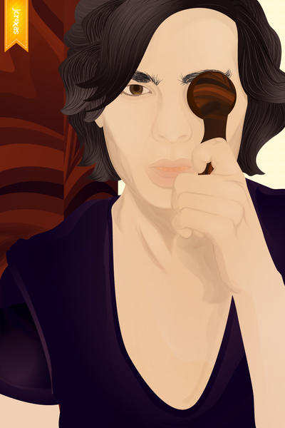
Disclaimer on the star rating: The rating is completely arbitrary and in no way representative of how I feel about this piece. I'm writing this to provide feedback, not to rate if a piece is hot or not based on some vague criteria.
This piece is really good for a first try at a vector portrait, and those are incredibly hard to pull off. I really like how the hair looks, and the incredible amount of detail you put in the eyebrows.
There's also something to be said of you not making the white of his eyes and his teeth stark white, which is a common 'trap' to fall into when doing portraits (because those areas aren't always brighter than the area surrounding it - in fact they aren't most of the time).
The colors don't look right, however: the teeth are too yellow, and don't contrast enough with the lips - making them blend together. There's also a kind of fold in his lower lip, making it look like he has two lower lips.
The white of the eye has a color that looks too close to that of his skin. (Though the contrast between his eye and skin is fine.)
The skin color of his hand and that of his chest is too similar. At a small area at the wrist the colors even blend together completely. Looking at the picture you used as reference, there's no area where the color of the hand and chest blend together, and there seems to be a pretty stark 'line' around the hand. But that said, you did do a great job drawing the hand as well!
Looking at the skin as a whole I think you're a bit shy with pushing contrast, and there are no highlights at all. The area on his forehead is brighter than the rest of his face, so is the bow of his nose (and to a lesser extent, a part of his left cheek).
You mentioned in the comments that you also wanted to learn to do fabrics, but I don't really think that's any issue. In the reference picture you used the shirt is blurred, so there's no textures to be seen, only the folds of the fabric. Those folds weren't included in this piece, which is why the shirt looks the way it does.
And... that's it <img src="e.deviantart.net/emoticons/s/s…" width="15" height="15" alt="
I hope this critique was helpful!