ShopDreamUp AI ArtDreamUp
Deviation Actions


Suggested Deviants


Suggested Collections


You Might Like…


Featured in Groups


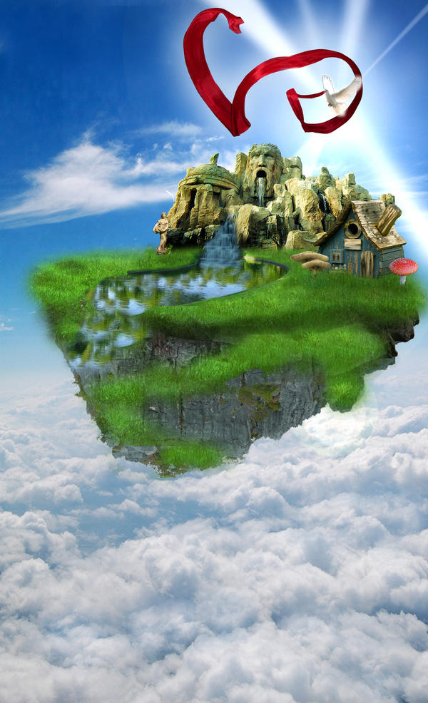
Description
for 
themes used:
1. nature
2. emotion - peaceful and love for nature
3. Teamwork- because the teamwork of the stocks used with the grace of the stock owners were able to create a very beautiful masterpiece
stocks used:
Rocks by and
and 
Grass by
Statue by
Sky by
Waterfall by
River by
Dove by
Ribbon by
House by
Mushrooms by and
and
HAVE FUN! ^_____________^
comments will be appreciated. thanks so much!
themes used:
1. nature
2. emotion - peaceful and love for nature
3. Teamwork- because the teamwork of the stocks used with the grace of the stock owners were able to create a very beautiful masterpiece
stocks used:
Rocks by
and Grass by
Statue by
Sky by
Waterfall by
River by
Dove by
Ribbon by
House by
Mushrooms by
and HAVE FUN! ^_____________^
comments will be appreciated. thanks so much!
Image size
1826x3000px 2.86 MB
© 2009 - 2024 jcroxas
Comments103
Join the community to add your comment. Already a deviant? Log In
First of all, I want to say that the work is striking at first glace and really wakes you up and making you wonder: "Hey, what's going on? I want to know more."
Since you've entered in a critique fest and I was assigned to critique yours, I'm sure you won't mind me giving you some negative pointers. <img src="e.deviantart.net/emoticons/s/s…" width="19" height="19" alt="
The thing that isn't working for me here, is the grass. It's confusing me because it's not cropped cleanly like everything else! It has this cloudy texture all around and it should have been sharper with strands of grass popping out making it more realistic! I totally understand that grass is hard to make it look nice in the edges but perhaps some grass brushes could've helped with those "extra strands". You know?
The ribbon is a great touch but I think it should've been more subtle since it's the only "bright-red" of the piece, it's overwhelming at first sight and maybe that's the intention but it's a bit over done. It would have blended in better if you put a bit of red-ish glow to the clouds or something so the red isn't too "random"... if you know what I mean.
But otherwise, I think you did a great job on blending the statues and house, so the technique is good but I don't see the concept (with the mushroom and all... or maybe it's just me <img src="e.deviantart.net/emoticons/e/e…" width="15" height="15" alt="
I really think you have potential! Keep it up and practice makes perfect!